
A design system is much more than a set of HTML elements, CSS styles, and typography. It's a way of thinking about the world and how the world will see you in it. It builds consistency, which becomes familiarity, which builds trust between you and your users. It frees your team to experiment, prototype, and learn, and it makes it much easier for your newest hires to contribute on day one.
In software, a design system has the added advantage of reusability. Color & size definitions, arrangement of DOM nodes and CSS classes, animation parameters, and interactivity are, with planning, not only reusable in the actual product, but can be updated independently of the product itself.
Design systems for web apps typically incorporate a living style guide, a code-driven view of the state of design tokens and elements. They may also implement a playground for each component, letting the developers and designers experiment with the component in question to try different usages of the component using real code.
Vue makes a lot of pieces of building a design system very easy:
- Single file components, split by Webpack into templates, code, and styles, make it easy for both designer and developer to work on the same, single file. Without this setup, styles typically get held in a separate file, as you might do with React, and this means more jumping between files to edit styles and markup.
- Templates are interpreted and use directives for logic. I thought this approach in the AngularJS 1.x days was wrong, but after a lot of work in React with the HTML-like-but-not-actually-HTML JSX, I’ve come back around to the template approach, especially if I’m handing off components to designers to work on.
- Scoped styles make it easy to use sane class names without namespacing global class names. In React, I could get something similar by manually using css-loader with Webpack, but it wasn’t as seamless as it is with Vue. And, if you have to drop something in a global style in a Vue component (say, to style something within a Buefy component), you just make a new global style block and ensure that you put a good global class name on the component. Easy.
There were two talks (one of which, by Miriam Suzanne, has a video up now) about the state of design systems and living style guides at VueConf 2018. The Tidelift frontend was starting to get large enough that we were building some reusable components, but it was hard for a designer knowledgeable with HTML & CSS to get in there and modify them. We decided to go with the Vue Design System, which wraps up a living style guide and design token system.
When I asked for comments about the design system so far, developer Amanda McDermott says, "How do I make sure people know where to find things like common styles, mixins, components, and assets? How do I make sure the documentation for all these things exists and is kept up-to-date? Using a design system provides clear solutions to both problems, and helps limit the influence of implicit institutional knowledge."
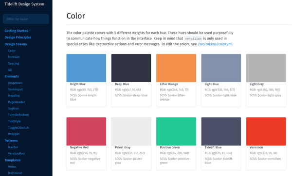
Still a work in progress. There’s a lot of defaults left over from the stock Vue Design System, but we’ll get there.
In the prior component-based style guides I’ve worked on, there were two approaches for filling the guide: extract-and-reuse an existing component, or create a new component from scratch. When we started on the design system, we had a handful of components we either wanted to create or wanted to standardize:
- The switch for enabling/disabling Tidelift CI on a GitHub repo. It had some unique behavior (the ability to show an error message, showing a processing animation while trying to enable/disable the webhook, reimplementing b-switch so that we control when the switch is enabled/disabled) and was ripe for tweaking outside of the app. We extracted and reused this one as an initial test for the workflow.
- Page headers. Even though the app didn’t have a lot of pages yet, it did have four different implementations of page headers, each with twists: some had right-aligned items, some had text above or below the header. It was a perfect candidate for standardization, and Vue’s slots made handling all of these different cases for content around the title easy.
- A component to help lifters mark release versions with metadata about stability and activity. This was a new component with a complex data structure that I wanted to build in a way that took advantage of v-model for two-way data binding.
With these first three targets for standardization and documenting, we were off!
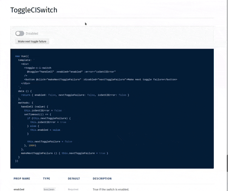
The extracted Toggle CI Switch in action within the living style guide, complete with props and event documentation. Being able to interactively test the component within a self-contained Vue instance made development very fast.
We are still experimenting with our workflow, so post-mortems, filled out by both the developer and designer involved on the component, are important for growth. At this stage, much of the feedback revolves around learning how Vue works and how to handle merge conflicts. Once time goes on, I hope more of the comments move toward using testing-related issues and trialing new versions of components in the app for user feedback.
“Being able to experiment in a component without taking up engineering time was awesome!” says designer Lauren Hanford. “This will allow us to focus on the usability of a feature when we pair, knowing that we can easily change the visual design and push consistency out across the app later. Also, how I feel about scoped CSS:”

One thing we added was unit testing using Mocha and Chai (VueDS added Jest in version 2.1 and we started using it at 2.0. Still, I prefer Mocha+Chai over Jest and would’ve changed it out anyway). Again, with the way that Vue single file components work, writing unit tests against components and getting the tests to run on each Travis CI build was a piece of cake. We have not tried venturing into snapshot tests yet (there is a Chai plugin for that). I know that will prompt some discussion about usefulness after we’ve had some time to get used to the design system.
The recommended way of getting the design system into your Vue app is by publishing a private NPM package of the final build, but we found that dealing with multiple NPM users and private package access for each was way more difficult than committing the dist folder on each internal version bump. When an update to the design system happens, a PR is merged to master, the NPM version is incremented right on the master branch, and the contents of dist are committed with that version bump and made accessible to the Vue app when it’s included in package.json using a git+ssh URL. Will this bloat up the history and repo size of the project? Sure, but for us, the tradeoff was worth not having to manage a ton of individual private NPM accounts.
The real test will be when we start using the design system in non-Vue ways. We have a static site that has a lot of the same tokens and elements as the app. These are currently being built by hand, but finding a way to reuse the HTML from the Vue components and the CSS in static areas will save time. So far, developer and designers at Tidelift have been loving using it!
If you're interested in learning more about Tidelift and the Tidelift Subscription (now supporting the Vue.js ecosystem), subscribe to updates and follow us on Twitter.

 50 Milk St, 16th Floor, Boston, MA 02109
.svg)